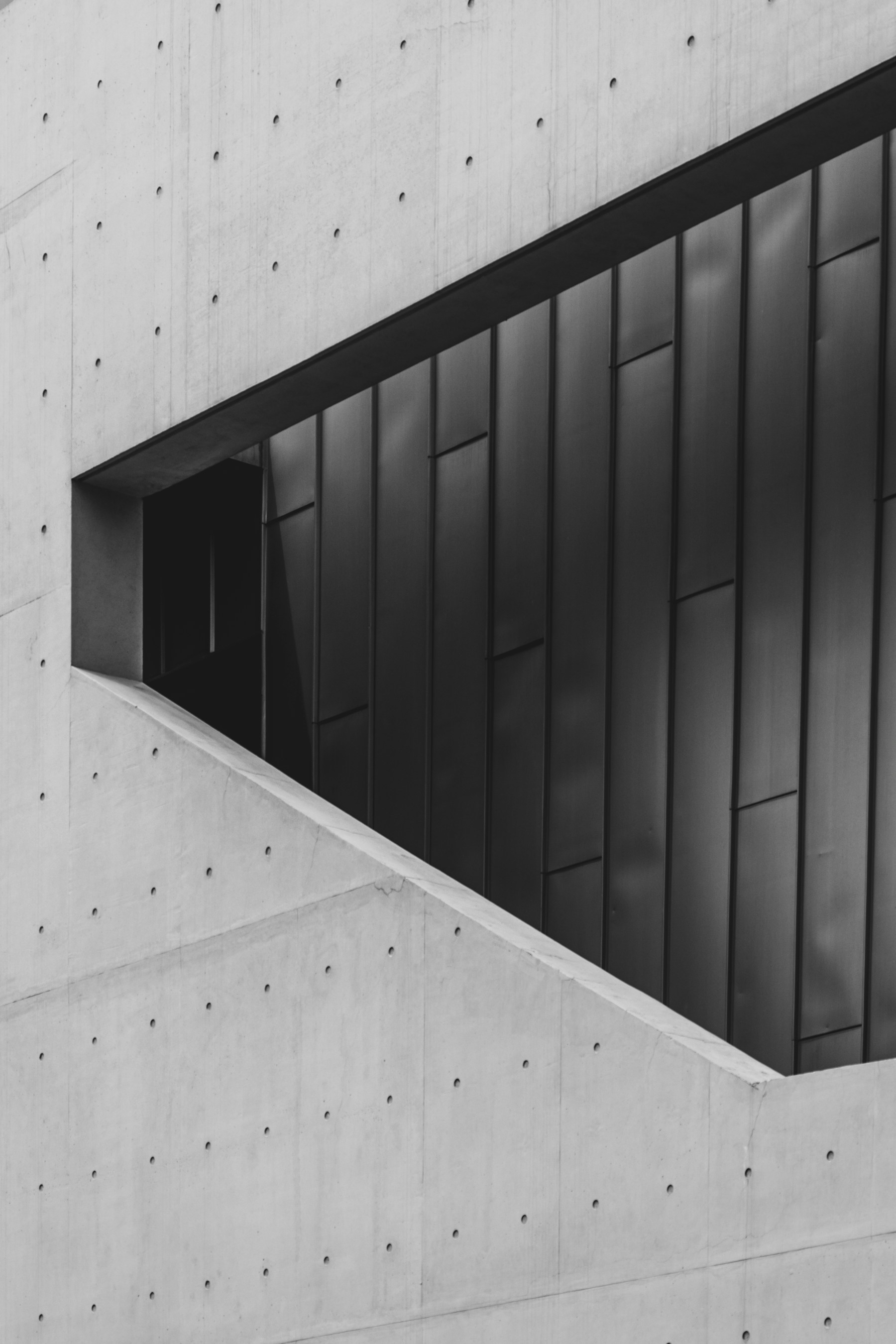
Why a little breathing space can make your message feel more confident.
When we begin a page, the instinct is often to fill it. Another image, a longer headline, one more reason to believe. Yet the most useful first question may be: what deserves the reader’s attention?
Give one idea the lead.
A strong layout does not ask every element to speak at once. Choose the one thing a visitor should understand first. Let the heading introduce it, the image support it, and the next action follow naturally.
Space is what lets that relationship become clear. A generous margin can separate a new thought. A quiet area around a button can make the next step easier to notice.
Space is not what remains after designing. It is part of the design.
Build a rhythm, not a formula.
Alternate between expansive and intimate moments. A broad image might establish the mood; a narrow column of text can bring a reader closer. Consistent spacing connects those moments without making every section identical.
Try this on your next page.
- Write down the single purpose of each section.
- Remove one element that repeats what another already says.
- Check the page on a small screen, where space is especially valuable.
- Keep a clear, visible next step.
The aim is not to make the page empty. It is to make room for the things that matter.